


Over 10 years we help companies reach their financial and branding goals. Engitech is a values-driven technology agency dedicated.
2nd floor, Urmi complex, 15, IT Park Rd, near Information Technology Park, Gayatri Nagar, Pratap Nagar, Nagpur, Maharashtra 440022
codeswizards@gmail.com
+91-8600376344
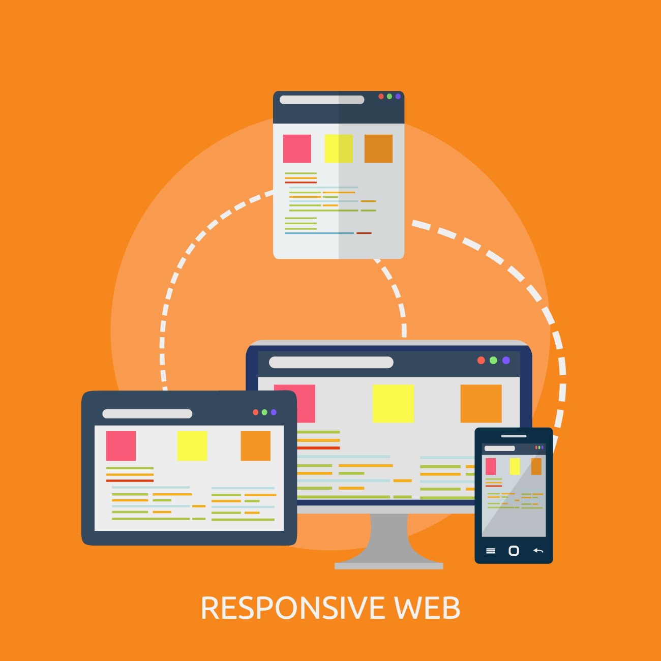
In today’s fast-paced digital world, users access websites from a wide variety of devices — smartphones, tablets, laptops, and desktops. With mobile traffic dominating the internet, having a Mobile Responsive website is no longer optional — it’s essential. At codes wizards, we specialize in creating Mobile Responsive websites that adapt seamlessly to any screen size, ensuring an exceptional user experience across all devices.
At Codes Wizards, we offer end-to-end Mobile Responsive web development services designed to enhance user engagement and boost your online reach. Our expert developers use the latest technologies and frameworks to ensure your website looks stunning and performs smoothly on every device.
We design websites that automatically adjust to any screen size, ensuring a consistent experience for users. Our designers focus on flexible grids, fluid layouts, and responsive typography to maintain perfect visual harmony.
LEARN MORE
Our team follows a mobile-first strategy — designing and developing for mobile screens first, then scaling up for larger devices. This ensures optimal performance and usability for mobile users, who form the majority of online visitors today.
LEARN MORE
We thoroughly test your website across multiple browsers and devices to ensure that your Mobile Responsive site performs perfectly everywhere — whether on Chrome, Safari, Firefox, Android, or iOS.
LEARN MORE
A Mobile Responsive website isn’t just about appearance — it’s about speed and efficiency. We optimize your site’s loading time, image compression, and caching to deliver lightning-fast performance.
LEARN MORE
If you run an online store, we make sure your product pages, checkout process, and payment gateways are fully Mobile Responsive, providing your customers with a smooth and secure shopping experience.
LEARN MORE
We don’t just build; we maintain. Our team provides ongoing updates and maintenance to ensure your Mobile Responsive website stays aligned with the latest design trends and technology updates.
LEARN MORE
The importance of Mobile Responsive design cannot be overstated. With over half of global website traffic coming from mobile devices, a non-responsive website can drive away potential customers and negatively impact your online presence.
Here’s why having a Mobile Responsive website is critical for your business success:
Visitors are more likely to stay and explore when your site looks and functions perfectly on their device.
Google prioritizes Mobile Responsive websites in search results, improving your SEO performance.
Responsive designs are optimized for mobile performance, ensuring quicker loading times and reduced bounce rates.
A mobile-friendly experience builds trust and encourages visitors to take action — whether it’s making a purchase or filling out a contact form.
Mobile Responsive designs adapt easily to new devices and screen resolutions, keeping your site ready for the future.

Our proven development process ensures that every Mobile Responsive website we create is fast, secure, and scalable:
Understanding your business goals, audience, and design preferences.
Creating responsive wireframes and layouts that adjust to various devices.
Using HTML5, CSS3, Bootstrap, and other modern frameworks for a Mobile Responsive experience.
Conducting cross-device and cross-browser testing to ensure flawless functionality.
Launching your Mobile Responsive website with optimized performance and SEO-friendly code.
Providing continuous monitoring, updates, and performance enhancements.
A Mobile Responsive website is one that automatically adjusts its layout, images, and content based on the device and screen size being used. This means that whether your audience visits your site on a smartphone, tablet, or desktop, they enjoy an optimal viewing experience without the need to zoom or scroll excessively. At Codes Wizards, we design and develop websites with flexible grids, fluid layouts, and adaptive images that maintain visual consistency and usability across platforms. Our Mobile Responsive approach ensures that your brand looks professional and functions flawlessly, no matter how your audience accesses it.

Your website is often the first impression your audience has of your brand — make it count. A Mobile Responsive design ensures that every visitor, on every device, experiences your brand at its best. At [Your Company Name], we help you stay ahead in the mobile era with responsive, scalable, and high-performing web solutions. Whether you’re building a new site or revamping an existing one, our Mobile Responsive web development services guarantee a superior digital experience. Let’s build a website that looks stunning everywhere — because your audience deserves it.